branding development + identity system + responsive website + collateral Breathing fresh life into a communications studio with a dynamic brand language and open call to ignite and incite collaboration. The site design is built to be responsive to device and touch, with multiple native … Read More →
Category Archives: identities (systems + logos + wordmarks)

fritz mueller photography
online + identity redesign While well known, the online environment had been relatively untapped by the Yukon photographer. Two divergent sites needed to be updated and coalesced, merging traffic and unifying the brand presence, while integratibng a more comprehensive and visible stock/purchase component. It was determined … Read More →
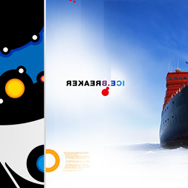
icebreaker
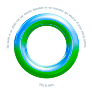
identity and print communications collateral …to create a visual experience inspired by a cohesion of the facets of its name, particularly national, cultural and metaphorical. Part of an ongoing series of individualized explorations concerning these and associated ideas. The ‘circle’ card is printed on vellum, two-sided with … Read More →
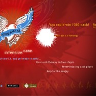
otherball 5.0
marketing industry event microsite Held annually in Toronto as the alternative to the official direct-mail industry party, the purpose being to raise money and awareness for the Daily Bread Food Bank. The mandate, supplied with the ‘tattoo’ of heart-and-wings, was to provoke along the theme … Read More →
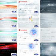
scotiabank : aero platinum visa
credit card design and program identity A Scotiabank International rewards program being launched in the Caribbean before going global, the Aero program had as its flagship and launch product a platinum credit card. The benefit for the user was first-time true ‘any seat, anywhere, anytime’ … Read More →

yukon energy : engagement campaign
public engagement campaign + brand refresh The electrical energy corporation in the Yukon needed a multi-year campaign roadmap to engage disparate audiences, residents and businesses alike, across the Yukon and Northern BC, during the planning stages leading up to new construction projects to meet electrical energy demand … Read More →
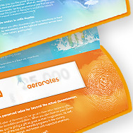
aeroplan : aeronotes
brand development + launch Development and launch from the initial consumer platform for the general corporate audience, and the introduction of the aeroplan currency. 2005. concept / direction / design / typography / illustration
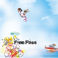
free pass wakeboard festival
festival branding A cottage country institution in Ontario. Look and feel established, then rolled out to everything from posters and stickers to shirts and some sweet boards. concept / direction / design / typography / illustration
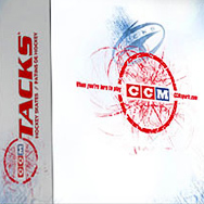
ccm sports
visual identity refresh + packaging The venerable hockey brand, solid as ever with their product but suffering from a staid reputation, mandated a visual refresh with energy and contemporary relevance, while respecting heritage, with no change permitted to the identity itself. (The ’72 logo was finally … Read More →


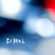
cabral pictures
branding + identity system, website A marketing and stage veteran moved to action, from documentaries to broadcast spots. A multi-faceted, ameobic identity system that radiates character regardless of the spotlight. The identity fluxes between light and dark, warm and cool. Below: site land page in ‘cool’ mode; part of the identity … Read More →