08-09 season branding and design
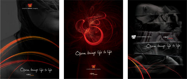
After developing an organic progression from the previous season’s branding platform, the essence of the season’s look and feel was hinged on human emotion, echoing not only the core of the productions, but the central appeal of the operatic experience itself.
 Using ‘emotional flares’ and handwriting to add energy and language to the mood
of the monochromatic photography, the notion of creating a personal and singular resonance between the art form and the audience was shown to breathe life into
the brand itself, as well the season as a whole.
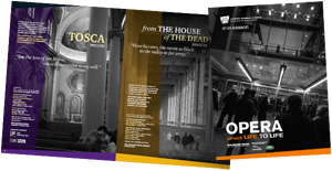
 Shown: the main prospecting brochure and posters, illustrating central aspects
of the full visual rollout, and the smaller renewal brochure.
direction / design / typography / handwriting / illustration
+
08-09 season branding and design : conceptual design phase
The mandate from the COC was to enliven and broaden the 08-09 season’s look
and feel relative to the previous seasons.

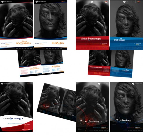
 With a rough direction for photography already established, and the COC brand guide as a base (primarily the ID, colour palette and two typefaces), conceptual exploration revolved around the design direction for the productions themselves within the larger context of the season branding as a whole.

The directions that developed and were pitched (in the form of posters, prospecting brochure spreads and covers) are shown above in general succession of progression relative to the previous season’s design direction, shown right.
concept / direction / design / typography / illustration

canadian opera company 08/09 season
08-09 season branding and design
After developing an organic progression from the previous season’s branding platform, the essence of the season’s look and feel was hinged on human emotion, echoing not only the core of the productions, but the central appeal of the operatic experience itself.
of the monochromatic photography, the notion of creating a personal and singular resonance between the art form and the audience was shown to breathe life into
the brand itself, as well the season as a whole.
of the full visual rollout, and the smaller renewal brochure.
direction / design / typography / handwriting / illustration
+
08-09 season branding and design : conceptual design phase
The mandate from the COC was to enliven and broaden the 08-09 season’s look
and feel relative to the previous seasons.
The directions that developed and were pitched (in the form of posters, prospecting brochure spreads and covers) are shown above in general succession of progression relative to the previous season’s design direction, shown right.
concept / direction / design / typography / illustration