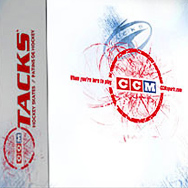
visual identity refresh + packaging The venerable hockey brand, solid as ever with their product but suffering from a staid reputation, mandated a visual refresh with energy and contemporary relevance, while respecting heritage, with no change permitted to the identity itself. (The ’72 logo was finally … Read More →
Category Archives: direction
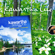
kawartha life / kawartha seasons
magazine relaunch With a redesign underway to revitalize an aging regional publication named Cottage Country Connection, it became apparent the change needed to be more than cosmetic, and a new magazine was born, focusing on a wider regional representation for tourism as well as a … Read More →
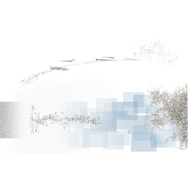
hp : adaptive enterprise
website : conceptual phase An ambitious online endeavour for Hewlett-Packard, following a successful globally interactive Whiteboard, who wanted to engage business solutions customization with the same personalization, responsiveness and data visualization and gathering. This concept took users ‘into’ the 2D space whilst they were feeding … Read More →
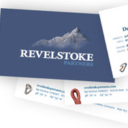
revelstoke partners
branding consultation + identity system + collateral Revelstoke, corporate revitalization specialists, desired an identity for their new company embodying the vision of ‘a cabin up in the mountains where we can lock ourselves in for 2-3 days straight and come up with a complete turn-around … Read More →

comdev
Yukon Tourism euro campaign; Coors Light Mystery Mansion microsite; TD CanadaTrust ticker ads; Comdev site...
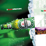
heineken : global brochure
global brand brochure Illustrating the rich heritage and unique quality measures that go into making the famous beer. Worldwide distribution to retailers and distributors. Circa 2001. direction / design / typography / illustration
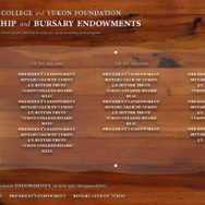
yukon college : endowment wall
wall installation A permanent focus of appreciation for benefactors within Yukon College’s main campus in Whitehorse. The mandate was to respect the natural environment, the architectural motif that predominated. The project employed local craftsmen and locally reclaimed wood, glass and vinyl. 11 x 5 feet. 2009. strategy / concept / … Read More →
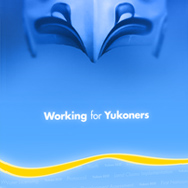
yukon government : executive council
modular public staging For the Premier and the Executive Council Office: a modular system designed for on-location environmental staging, using as a core a series of interchangeable, retractable banners. Shown: the formal, broad-base series. 2009. concept / direction / design / illustration
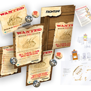
merial : frontline
promotional campaign Already the flea-killer category leader, Merial wanted an engaging promotional campaign for it’s Frontline brand for a spring push campaign. Our solution was a compact, scalable, functionally-based kit, with separate incentive programs for clinics and their clients. The ‘dead flea of the old West’ … Read More →
various clients : identities
identities for: an online arts zine, a consumer advocation group, and two network creators...

free pass wakeboard festival
festival branding A cottage country institution in Ontario. Look and feel established, then rolled out to everything from posters and stickers to shirts and some sweet boards. concept / direction / design / typography / illustration