Digital sketch on the eve of the winter solstice total lunar eclipse, 2010. concept / drawing / illustration
Category Archives: illustration

yukon energy : engagement campaign
public engagement campaign + brand refresh The electrical energy corporation in the Yukon needed a multi-year campaign roadmap to engage disparate audiences, residents and businesses alike, across the Yukon and Northern BC, during the planning stages leading up to new construction projects to meet electrical energy demand … Read More →
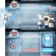
coors light : subzero
promotional microsite Special draught towers keep Sub-Zero beer frostier than normal taps. The ask: engage, entertain, then send them to the nearest tower. The answer: the CLSZ Science Lab, with a finger-lickin’ temperature reader, interchangeable heads, a dynamic nav, and the Sub-Zero-inator, which makes cubes … Read More →

hotsauce
Initial cover concepts for a book about the hot sauce culture, specifically in the U.S. Typography in some concepts was left unrefined for purposes of client presentation. Circa 2003. concept / direction / design / typography / illustration
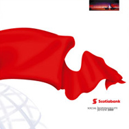
scotiabank : social responsibility review
A strategically aggressive response to competitive positioning in the face of new social responsibility reporting legislation for financial institutions in Canada. Project scale that of an annual report. Shown: chosen cover and other pitched concepts. Circa 2000. concept / direction / design / typography / illustration
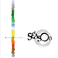
various book covers
Left: an historical refresh and reprint. Right: two poetry books. concept / direction / design / illustration / typography
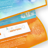
aeroplan : aeronotes
brand development + launch Development and launch from the initial consumer platform for the general corporate audience, and the introduction of the aeroplan currency. 2005. concept / direction / design / typography / illustration
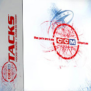
ccm sports
visual identity refresh + packaging The venerable hockey brand, solid as ever with their product but suffering from a staid reputation, mandated a visual refresh with energy and contemporary relevance, while respecting heritage, with no change permitted to the identity itself. (The ’72 logo was finally … Read More →

kawartha life / kawartha seasons
magazine relaunch With a redesign underway to revitalize an aging regional publication named Cottage Country Connection, it became apparent the change needed to be more than cosmetic, and a new magazine was born, focusing on a wider regional representation for tourism as well as a … Read More →




scotiabank : aero platinum visa
credit card design and program identity A Scotiabank International rewards program being launched in the Caribbean before going global, the Aero program had as its flagship and launch product a platinum credit card. The benefit for the user was first-time true ‘any seat, anywhere, anytime’ … Read More →