modular public staging For the Premier and the Executive Council Office: a modular system designed for on-location environmental staging, using as a core a series of interchangeable, retractable banners. Shown: the formal, broad-base series. 2009. concept / direction / design / illustration
Category Archives: graphic design
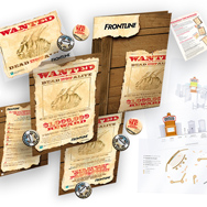
merial : frontline
promotional campaign Already the flea-killer category leader, Merial wanted an engaging promotional campaign for it’s Frontline brand for a spring push campaign. Our solution was a compact, scalable, functionally-based kit, with separate incentive programs for clinics and their clients. The ‘dead flea of the old West’ … Read More →
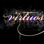
various clients : identities
identities for: an online arts zine, a consumer advocation group, and two network creators...

labopharm
branding + identity system A pharma company that specializes in control-release technologies of small molecule drugs, Labopharm needed a stronger branding presence on the global stage to augment and amplify their clinical emergence as a category leader, highlighting their full integration and entry into the … Read More →
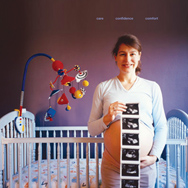
cml healthcare
An annual report for CML Healthcare, a national network of medical imaging clinics and laboratory services centers

scotiabank : caribbean merchants
retail merchant promotional program Created to promote card usage and reinvigorate impressions of Scotiabank International in the Caribbean, the program mandate was to revolve around the consumer experience on from a day-to-day, local perspective. Keying initially to restaurants and grocery stores, awareness and relevancy had … Read More →
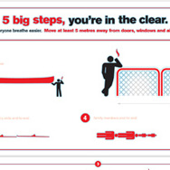
yukon government : 5m campaign
awareness campaign The Yukon Health and Social Services ministry needed a way to remind smokers where it’s legal to smoke; a little local irreverence employed as a pneumonic achieved awareness across media… Shown applications here: bus, arena sideboards, restaurant trayliners. It’s a colourful culture, the Yukon. … Read More →

oracle : partner program
print communications + brand refresh Left: A minimalist approach to an elite suite of network enhancements offered to Fortune 500s; using the old program ID. Right: the new identity serving as the cornerstone for an agressive restaging. concept / direction / design / typography
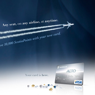
scotiabank : aero rewards
program branding + launch The Aero Rewards program, a loyalty program based around the ‘any seat, anywhere, anytime’ luxury, initially calibrated to upper-class frequent travelers. Shown: conceptual directions, in the form of awareness and billboard ads; below, brand guidelines. concept / direction / design / illustration

arius research
rebrand + online launch The Canadian biotech firm, in the vanguard of discovering and developing the next wave of antibody therapeutics, and on the heels of phase approvals of candidates from their antibody generation engine, needed a much stronger presence to activate, amplify and communicate … Read More →

yukon college : endowment wall
wall installation A permanent focus of appreciation for benefactors within Yukon College’s main campus in Whitehorse. The mandate was to respect the natural environment, the architectural motif that predominated. The project employed local craftsmen and locally reclaimed wood, glass and vinyl. 11 x 5 feet. 2009. strategy / concept / … Read More →