credit card design and program identity A Scotiabank International rewards program being launched in the Caribbean before going global, the Aero program had as its flagship and launch product a platinum credit card. The benefit for the user was first-time true ‘any seat, anywhere, anytime’ … Read More →
Category Archives: typography
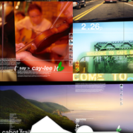
cape breton island
illustrated book Spread concepts and organization from a book about the physical, cultural and historical mosaic that is Cape Breton Island. In progress. concept / direction / design / photography

hotsauce
Initial cover concepts for a book about the hot sauce culture, specifically in the U.S. Typography in some concepts was left unrefined for purposes of client presentation. Circa 2003. concept / direction / design / typography / illustration
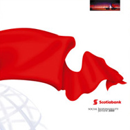
scotiabank : social responsibility review
A strategically aggressive response to competitive positioning in the face of new social responsibility reporting legislation for financial institutions in Canada. Project scale that of an annual report. Shown: chosen cover and other pitched concepts. Circa 2000. concept / direction / design / typography / illustration
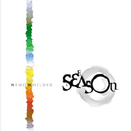
various book covers
Left: an historical refresh and reprint. Right: two poetry books. concept / direction / design / illustration / typography
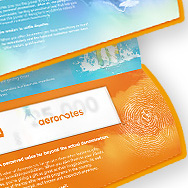
aeroplan : aeronotes
brand development + launch Development and launch from the initial consumer platform for the general corporate audience, and the introduction of the aeroplan currency. 2005. concept / direction / design / typography / illustration

free pass wakeboard festival
festival branding A cottage country institution in Ontario. Look and feel established, then rolled out to everything from posters and stickers to shirts and some sweet boards. concept / direction / design / typography / illustration
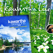
kawartha life / kawartha seasons
magazine relaunch With a redesign underway to revitalize an aging regional publication named Cottage Country Connection, it became apparent the change needed to be more than cosmetic, and a new magazine was born, focusing on a wider regional representation for tourism as well as a … Read More →
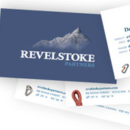
revelstoke partners
branding consultation + identity system + collateral Revelstoke, corporate revitalization specialists, desired an identity for their new company embodying the vision of ‘a cabin up in the mountains where we can lock ourselves in for 2-3 days straight and come up with a complete turn-around … Read More →



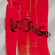
flights of nature : exhibit companion
exhibit companion print collateral The cover of a small brochure of referential material designed to accompany the body of paintings and drawings, ‘flights of nature’, scheduled to hang in 2013. concept / direction / design / typography / illustration